注册 | 登录

游侠NETSHOW论坛


查看: 3850|回复: 6
打印 上一主题 下一主题

[原创] FM12 博客第十二日 - 用户界面 第一部分(5L已翻译) [复制链接]

雷霆•飘雪
游侠元老版主
『体育游戏区』
游侠足球经理工作组 组长
AC米兰 功勋教练 199/200
游侠P.L第三届世界杯冠军
★★★

2015年杰出版主勋章2013年度杰出版主勋章元老版主勋章版主勋章资深版主勋章勤劳之证

帖子
10654
精华
1
积分
6022
金钱
11102
荣誉
45
人气
447
评议
8

跳转到指定楼层
楼主
发表于 2011-9-27 20:01:32 |只看该作者 |倒序浏览
本帖最后由 wingat 于 2011-9-28 22:49 编辑

When you have a game with as much detail, and as many options in it like the Football Manager series, the interface between the person playing the game and the computer, known as the GUI (Graphical User Interface) is very important. Without it, you wouldn’t be able to find anything on the screen, so it’d all be a bit pointless.

I’ve often spoken previously about the work that we do with usability companies to try and improve the interface and make it easier for you, the people who play the game, to navigate around, and of course we’ve done that this year. We also have some code that has been tracking our testers and beta testers use of the interface, to see which screens they visit and how they get there, and all of this work has led to what I think is a more streamlined experience.

For those who’ve been playing the series for years, this years’ interface might take a little while to get used to – a few options have moved, there are some new menus, and a clearer split between “club” actions and “squad” actions and screens, but, essentially, everything is now more obvious to find.

We’ve also added something we dub “adaptive layout”. You can see a video of this at http://www.youtube.com/sigames#p/u/19/9iTXka94ePc, but this means that the higher the resolution you play the game in, the more information you can get on screen, with less “white space” in the game. We encourage you to change the games resolution until you find the right amount of information on the screen for you.

The key screens where these changes are noticeable is on the overview screens. These are like the manager homepage that was
added a while back, but now include profiles for clubs, players, nations and more, and add more or less panels according to the resolution. These new profiles have also been made the default for player profiles, for example, but if you want to be a luddite and live in the past, you can change it in the preferences to go to the player attributes screen instead.

On the squad screen, and most screens with columns, you can add and remove columns to your hearts’ content, to really have the interface the way you want it to.

In the spirit of configurability, and as we’re regularly asked on our forums how to change some of the text colours in the game and in particular the colours of the attribute values, we’ve now made this easier too.

The way to do this before was by manually extracting and editing an xml file which isn’t the easiest to explain to people who just want to change a few colours. We’ve now got a simple Attribute Colours panel in the Preferences screen where you can pick your own colours for these and some of the other colours used throughout the game.

We’ve also changed the way you navigate using the Back and Forward arrow buttons. Previously, clicking on them would go through the different players or teams etc. that you’d visited, rather than the different sections within each player or team. So, if you had gone from the team Squad screen to a player’s Profile, and then gone to look at his contract details, clicking on the Back arrow would take you back to the squad screen, which doesn’t really make much sense in this world of people being used to web browsers.

Now if you click Back, it will go back to his Profile, and then clicking it again would take you back to the Squad screen.

However, much like web browsers, if you hold down the back arrow, the last 25 panels you’ve visited are there, so you can just go straight to the one on the list you want to go to. Or, if you want to be a luddite, you can change the system back to what we had in fm2011 in the preferences…

There are also huge changes to way that you can search for players and staff in the game, with a much more powerful filtering system. There are some new ones in there, but it’s a lot easier, and quicker, to filter to find exactly the kind of player and staff that you want to sign.

This is one of those features that is quite difficult to describe in words so here are some screenshots that show you how it works.


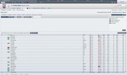
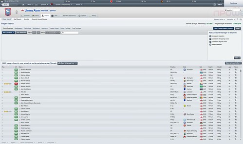
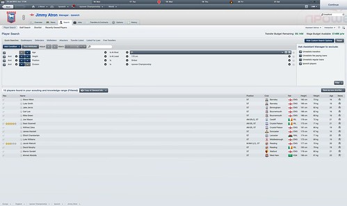
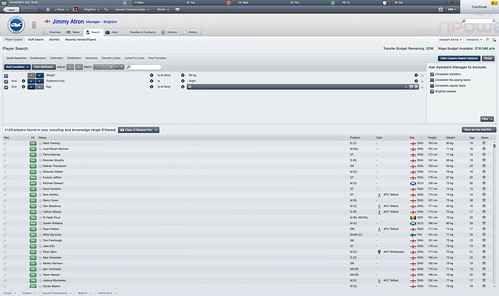
It should also be mentioned that the list updates dynamically now as you change your search parameters.

And whilst we’re in screenshot mode, tomorrow’s blog will be a little bit different to the others. No video blog. Not much being written, just lots and lots of screenshots for features we’ve already talked about. And maybe some we haven’t, but will be in the coming weeks…

You can discuss this blog here: http://community.sigames.com/showthr...dback-GUI-pt-1

英特尔 Core i7 6700K@ 4.0GHz
华擎Z170 Extreme4
金士顿 骇客神条 Fury系列 DDR4 2400 8G*2
索泰 Geforce GTX1060-6GD5 X-GAMING OC
饥饿鲨 Vertex460系列 240G
明基 BNQ7C04 BenQ M2200HD

使用道具 举报

帖子
36
精华
0
积分
18
金钱
354
荣誉
0
人气
0
评议
0
沙发
发表于 2011-9-27 21:23:09 |只看该作者
坐等汉化{:26:}{:2:}{:2:}
I want nobody but you!!

使用道具 举报

帖子
36
精华
0
积分
18
金钱
354
荣誉
0
人气
0
评议
0
板凳
发表于 2011-9-27 21:23:18 |只看该作者
坐等汉化{:26:}{:2:}{:2:}{:00:}{:00:}{:00:}{:00:}{:00:}
I want nobody but you!!

使用道具 举报

帖子
691
精华
0
积分
358
金钱
2032
荣誉
1
人气
13
评议
0
地板
发表于 2011-9-28 02:25:44 |只看该作者
去大中美买个菜,回来还没人汉化就接活~

使用道具 举报

帖子
691
精华
0
积分
358
金钱
2032
荣誉
1
人气
13
评议
0
5#
发表于 2011-9-28 06:54:32 |只看该作者
本帖最后由 airsun 于 2011-9-28 06:59 编辑

When you have a game with as much detail, and as many options in it like the Football Manager series, the interface between the person playing the game and the computer, known as the GUI (Graphical User Interface) is very important. Without it, you wouldn’t be able to find anything on the screen, so it’d all be a bit pointless.

当你有一个有很多细节的游戏,如同FM系列一样,玩家与电脑之间的界面,也就是GUI(图形用户界面)就非常重要了。如果没有这样一个GUI,你就没法在屏幕上找到任何东西,游戏就会毫无意义。

I’ve often spoken previously about the work that we do with usability companies to try and improve the interface and make it easier for you, the people who play the game, to navigate around, and of course we’ve done that this year. We also have some code that has been tracking our testers and beta testers use of the interface, to see which screens they visit and how they get there, and all of this work has led to what I think is a more streamlined experience.

我之前谈论过我们与可用性公司一起合作尝试改进界面以使得对你们玩家来说,浏览一圈会简单一点,当然我们今年确实做到了。我们有一些代码来记录测试者対UI的使用,用来观摩他们用了哪些页面以及如何进入那些页面的,所有这些工作带来了一个我认为是流线型的感受。这是虾米啊。。。

For those who’ve been playing the series for years, this years’ interface might take a little while to get used to – a few options have moved, there are some new menus, and a clearer split between “club” actions and “squad” actions and screens, but, essentially, everything is now more obvious to find.

对那些一直在玩我们这个系列的人来说,今年的UI或许会需要一点时间去适应——一些选项移动了,一些新的目录,更加清楚的分割了“俱乐部”与“阵容”的界面。但是,所有这些东西现在都会更加容易找到。


We’ve also added something we dub “adaptive layout”. You can see a video of this athttp://www.youtube.com/sigames#p/u/19/9iTXka94ePc, but this means that the higher the resolution you play the game in, the more information you can get on screen, with less “white space” in the game. We encourage you to change the games resolution until you find the right amount of information on the screen for you.

我们也加入了一些我们称作“自适应性布局”的东西。你可以看一个相关的视频(u2b的),这意味着你用越高的分辨率去玩游戏,你的屏幕上可以出现更多的信息,而不是空白。我们鼓励大家改变分辨率直到你找到合适自己的为止。(窗口党表示无力。。)


The key screens where these changes are noticeable is on the overview screens. These are like the manager homepage that was
added a while back, but now include profiles for clubs, players, nations and more, and add more or less panels according to the resolution. These new profiles have also been made the default for player profiles, for example, but if you want to be a luddite and live in the past, you can change it in the preferences to go to the player attributes screen instead.

这些变化可以在综述界面上看到。这些是经理的主页加上了俱乐部、球员、国家和其他档案。同时也根据分辨率增加了一些面板。这些新的档案也成为了默认的,比如说,球员档案界面,但是如果你想保持原有风格,你也可以改回去。


On the squad screen, and most screens with columns, you can add and remove columns to your hearts’ content, to really have the interface the way you want it to.

在阵容界面和其他多数有行列的界面,你可以按自己的想法增加和去掉列,使界面呈现你想要的样子。这原来有啊


In the spirit of configurability, and as we’re regularly asked on our forums how to change some of the text colours in the game and in particular the colours of the attribute values, we’ve now made this easier too.

本着DIY的精神,以及我们经常在论坛上被问到的怎么改字体颜色啊,我们现在把这个弄得简单了。


The way to do this before was by manually extracting and editing an xml file which isn’t the easiest to explain to people who just want to change a few colours. We’ve now got a simple Attribute Colours panel in the Preferences screen where you can pick your own colours for these and some of the other colours used throughout the game.

原来要做这个需要手动提取和编辑xml文件,并不是很容易向人们解释。现在我们在偏好设置里有了一个简单的属性颜色面板,你可以选择你想要的颜色。


We’ve also changed the way you navigate using the Back and Forward arrow buttons. Previously, clicking on them would go through the different players or teams etc. that you’d visited, rather than the different sections within each player or team. So, if you had gone from the team Squad screen to a player’s Profile, and then gone to look at his contract details, clicking on the Back arrow would take you back to the squad screen, which doesn’t really make much sense in this world of people being used to web browsers.

Now if you click Back, it will go back to his Profile, and then clicking it again would take you back to the Squad screen.

我们也改变了用前进和后退来浏览的方式。之前,点击他们会回顾你之前看过的球员,队伍,而不是同一个队员或球队界面的不同页面。所以,如果你从球队阵容界面介入球员档案,然后再看他的合同细节,点击后退会直接会到队伍界面,这并不是大家用浏览器的习惯。

所以如果你现在再点后退,就会回到球员档案,再次点击后退才会回到球队界面。就这也拿出来显摆一下。。。


However, much like web browsers, if you hold down the back arrow, the last 25 panels you’ve visited are there, so you can just go straight to the one on the list you want to go to. Or, if you want to be a luddite, you can change the system back to what we had in fm2011 in the preferences…

但是,就像浏览器一样,如果你一直摁住后退不放,最后25个页面你看过的就会全部出来~,你就可以去任何一个你想去的啦~。或者你想保持原样,你可以继续FM2011风格。。。


There are also huge changes to way that you can search for players and staff in the game, with a much more powerful filtering system. There are some new ones in there, but it’s a lot easier, and quicker, to filter to find exactly the kind of player and staff that you want to sign.

现在有一个更加强大的滤波器,対搜索球员和职员的方式也有很大的改变。它有很多新东西,但都会很简单很快捷过滤出你心目中的球员或者职员的口牙。

This is one of those features that is quite difficult to describe in words so here are some screenshots that show you how it works.


这是很难用文字描述的新特性之一,所以这有些截图你们自己看吧。。。。。


已有 2 人评分金钱 荣誉 人气 收起 理由
STZH + 1 filter翻成筛选比较好吧
wingat + 10 + 1 + 1 感谢翻译

总评分: 金钱 + 10  荣誉 + 1  人气 + 2   查看全部评分

使用道具 举报

帖子
122
精华
0
积分
61
金钱
551
荣誉
0
人气
0
评议
0
6#
发表于 2011-9-28 11:29:43 |只看该作者
强势插入前十{:30:}坐等楼下SB

使用道具 举报

帖子
126
精华
0
积分
63
金钱
1567
荣誉
0
人气
2
评议
0
7#
发表于 2011-9-28 16:19:23 |只看该作者
滤波器威武

使用道具 举报

您需要登录后才可以回帖 登录 | 注册

手机版|Archiver|游侠NETSHOW论坛 ( 苏ICP备2023007791号 )

GMT+8, 2024-4-27 04:24 , Processed in 0.339238 second(s), 12 queries , Gzip On, Memcache On.

Powered by Discuz! X2

© 2001-2011 Comsenz Inc.

分享到